
JJ Abrams sequel has a title, now confirmed by Paramount.
Let the speculation commence.


JJ Abrams sequel has a title, now confirmed by Paramount.
Let the speculation commence.


No speculation from me but, oh dear, what a rubbish title!
I wonder if there is deliberately no : ?
That's what I assumed at least, that the Trek had been verbified.


Into the Darkness?
Does this mean less lens-flare-effects?

Most posters for a scifi franchise movie include the name of the franchise, often in a distinctive, recognisable font that is unique to that franchise. Star Trek and Star Wars have been doing it for decades, but take a look at the Marvel Phase 2 posters, or Michael Bay's Transformers, and you'll see the same thing is going on. Fonts are a very powerful tool in product recognition: when you see something written in the Coca-Cola font, you don't need to know the words for your brain to conjure up the Coca-Cola connection. Movie studios are tapping into that power.
If you write "Star Trek Into Darkness" on a poster, all on the same line, you confuse that issue. You have to start reading words to know what's going on, and that dilutes the marketing power. Unless the marketing team is stupid, they'll end up splitting the title across two lines anyway, in order to preserve the brand recognition power of the "Star Trek" name.
Because of that, the posters are probably going to make people percieve the title as "Star Trek: Into Darkness", regardless of how Paramount punctuates it in their press releases.
At least, that's what we learned when I did my Graphics GCSE.
It's like that, and that's the way it is.

Yeah, I see that happening with the poster, too. And I agree with you on the public's consequent perception of the title. Therefore, I propose an alternate, and superior, title.
Star Trek Into Darkness: The Colon Rebellion
And now we're boldly going into the shady realm of gastrointestinal euphamism, which is rather fitting, giving the ghastly new title and all.
I'm just waiting to see Benedict Cumberbatch as the villain.
Karl Urban supposedly let a spoiler slip a few weeks ago when he made reference to the villain being Gary Mitchell from Where No Man Has Gone Before, but that's been backtracked to a great extent, I guess. The Khan speculation has been going around for months, it seemed to gain a lot of steam when Benicio del Toro was in the running for the bad guy, but that's fallen by the wayside. So in some ways, they've managed to keep the ID of the bad guy under wraps.

I just rewatched Star Trek 2009 and all the extras and it was amazing the lengths they went to to keep things secret from the public!
I dont care about the title, I'm excited for the film.
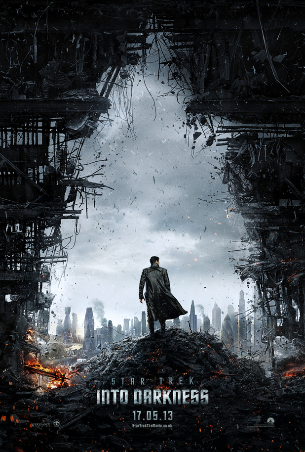
First poster revealed (featuring Benedict Cumberbatch) - looks very The Dark Knight-esque:
__________
"A Jedi must remain focused. Mastery of the Force requires that all unnecessary activities be purged from daily life."


Oh dear...

Thanks for sharing this
Movie Posters these days look like the last frame of an establishing shot in a video game
Guessing my 'Harry Mudd' prediction might be slightly off thenOriginally Posted by Rutabaga


I love comparing movie posters and seeing the trends. And how horribly they rip off from each other, lol!
...I still think it's a cool poster though. >_>


I don't get why the internet is making such a big fuss over this. Pretty much every news blog seems to have an article ranting about the blatant rip-off. Thing is, the whole "lets make the environment look like the logo!" idea was cooked up a long time before The Dark Knight Rises did it. Aside from there are some buildings, and the pattern of light and dark makes the movie logo, the posters have very little else in common.
By the internet's logic, both posters are also "exactly the same" as this Amazing Spider-Man poster: that uses light and shadow to make the movie's logo, too. And by extension, that Spider-Man poster is "exactly the same" as this piece of Phantom Menace marketing from fourteen years ago. In the United Kingdom, Channel 4 has these idents where the camera angle makes objects line up and make the channel's logo. I'm sure someone with a less patchy memory than me could find dozens of other examples, too.
The internet baffles me, sometimes. I could probably hand out free money, and someone somewhere would get internet cranky about it.
To be fair this isn't the most egregious or blatant rip off of a poster I've seen. Sometimes posters for different movies have the same bodies in them and only the faces are switched.
There are very few original ideas left, and I think the Star Trek poster is fine. Like I said, I still like it, even if the "single figure with back to camera facing industrial looking something or other/perhaps in the shape of its logo" has been done before.
For the best example ever of "Let's make the background look like the logo!," just go back to Will Eisner's old comics of The Spirit.
Teaser trailer now out:
PS. Don't forget - he's voicing Smaug too.
kinda looks like they are going to keep with the tradition of destroying each version of the Enterprise every movie or two...
Looking forward to it myself.
OMG.
That is all.


 Posting Permissions

 Reply With Quote

Bookmarks